

14 Oct Avoid These Four Data Visualization Pitfalls
If a picture is worth a thousand words, then a data visualization is worth at least 10,000. But there are many different ways to display your data, and that same data may be perceived very differently depending on how it’s displayed. This can inadvertently lead to confusing or misleading charts and graphs.
In this post, we’ve outlined four data visualization practices that may seem like a good idea but should actually be avoided.
1. Selecting visual encodings that over-emphasize differences.
In scientific visualizations, data needs to be presented as objectively as possible. To avoid misleading the reader, always use labels, ticks, title, and the full range of values when relevant. If you’re unsure, ask your colleagues for their interpretations of your data.
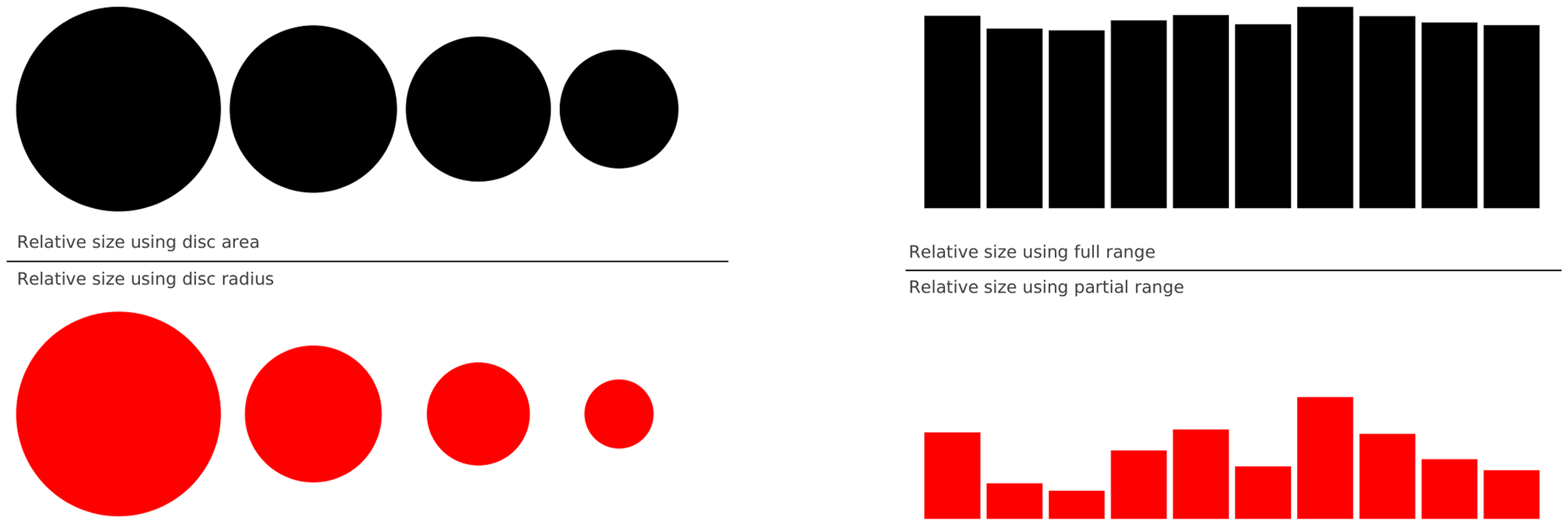
When presenting data, it’s very important that you don’t mislead the reader or use visual encodings that over-emphasize differences. For example, the series on the left represents four values: 30, 20, 15, and 10. In the upper left graph, the disc area represents the number, while in the bottom graph, the disc radius represents the number. The resulting graphs are very different. On the right, a series of 10 values is shown using full values (from 0 to 100) or a partial range in the bottom (y-axis goes from 80 to 100). While the values in both graphs are same, the visual perception of the two series is totally different.
2. Using too many colors.
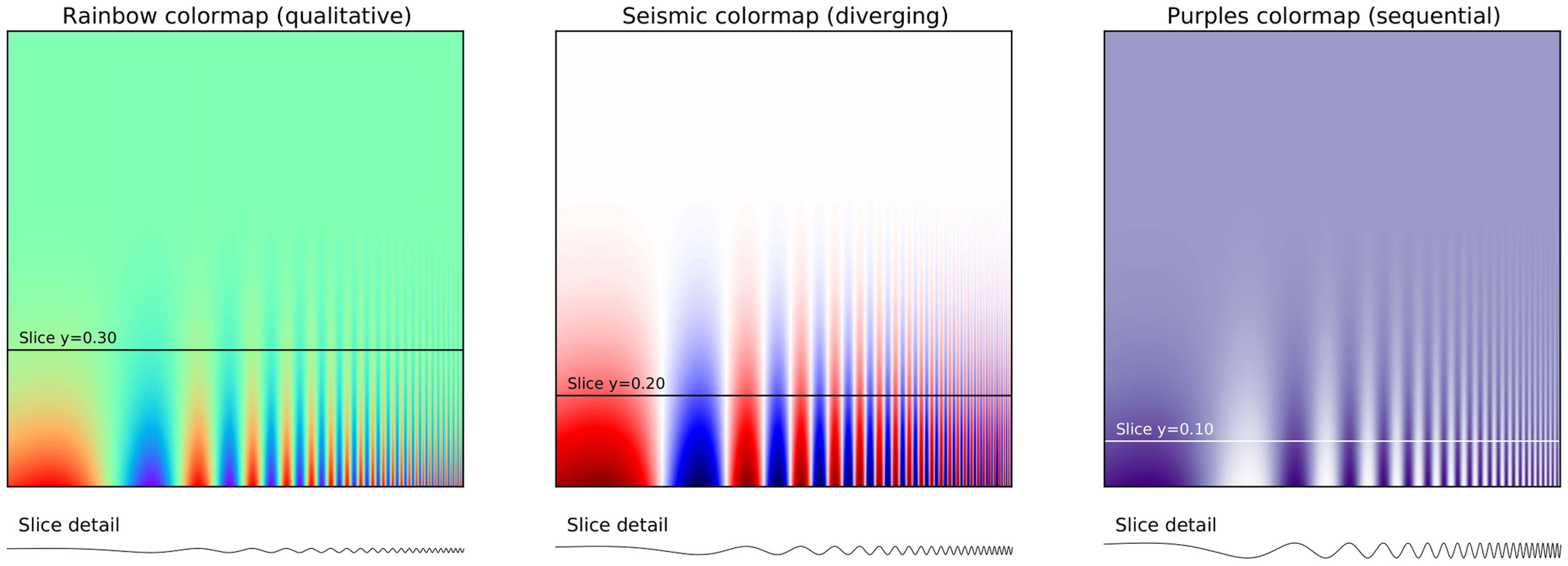
If you’re going to use color, use it effectively. Consider which colors you will use and how you will use them. If you’re using colormaps, our first point applies: don’t use the default (e.g. jet or rainbow). In the example below, both the default rainbow and seismic colormaps are equally bad because they hide details in the high-frequency domain (lower right corner). Using a sequential colormap, like the purple example here, makes it easier to see these details. For more on choosing and using color, check out this resourceful guide.
3. Including unnecessary visual elements.
Unnecessary or confusing items, also known as “chartjunk”, do not add value and may even create confusion. Chartjunk may include unnecessary labels and gridlines, too many colors, and distracting background colors.
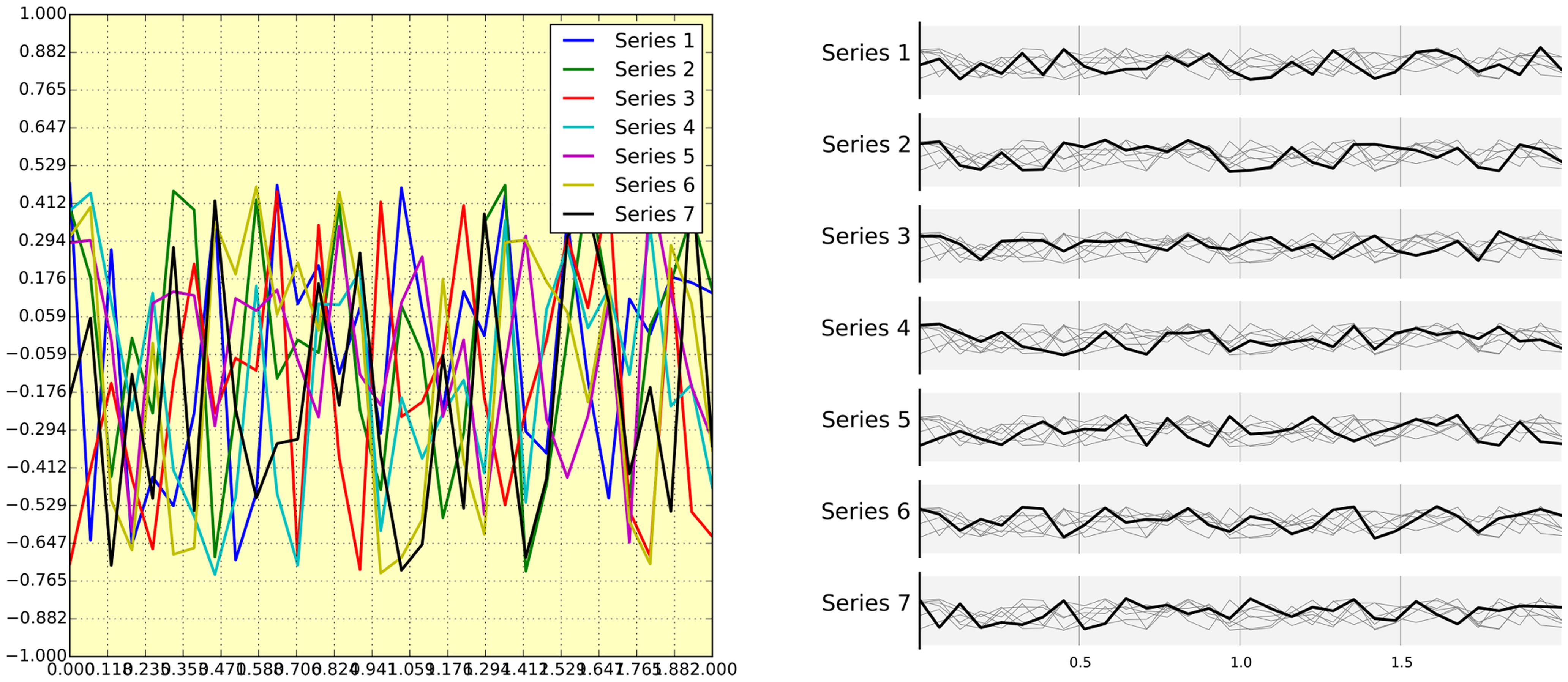
The figure on the left is full of chartjunk. The graph has too many ticks, curves that cover each other, a key that hides the data, and default colors that do not help distinguish them. The right figure displays the same data but uses a very different layout. It’s easier to read, contains only the necessary data, and is displayed without unnecessary colors, ticks, and key.
4. Using the default font style and size for axes.
Just because your plotting software has default settings for font, size, style, weight, it doesn’t mean you should use them. All plots require manual tuning to get the best results.
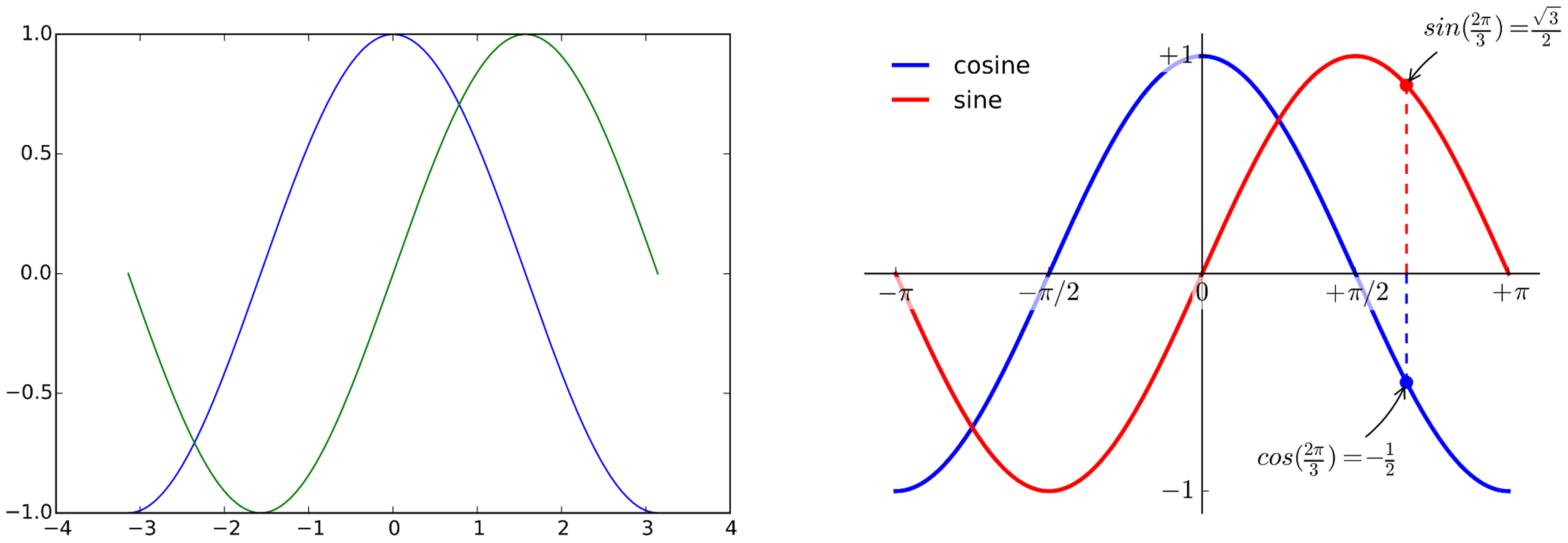
For example, the left image shows the sine and cosine functions using default settings in matplotlib. Just slightly tweaking the default settings results in the clearer graph on the right.
Adapted from Rougier NP, Droettboom M, Bourne PE. Ten simple rules for better figures. PLoS Comput Biol. 2014 Sep 11;10(9):e1003833


